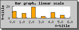
Figure 29: A small example with a bar graph using a linear X-scale [src]
Jpgraph also supports 2D vertical bar plots. Before you can use any bar plots you must make sure that you included the file "jpgraph_bar.php" in your script.
Using bar plots is quite straightforward and works in much the same way as line plots which you are already familiar with from the previous examples. Assuming you have a data array consisting of the values [12,8,19,3,10,5] and you want to display them as a bar plot. This is the simplest way to do this:
  $datay=array(12,
8,19,3
,10,5);

$bplot
= new BarPlot($datay);

$graph->Add(
$bplot);
If you compare this to the previous line examples you can see that the only change necessary was that instead of creating a new line plot (via the new LinePlot(...) call) we used the statement new BarPplot().
The other change we should do is to make sure the X-axis have an text-scale (it is perfectly fine to use a linear X-scale but in most cases this is not the effect you want when you use a bar graph, see more below). With this two simple change we will now get a bar graph as displayed in the following image You can of course modify the appearance of the bar graph. So for example to change the fill color you would use the BarPlot::SetFillColor() method. Making this small change to the previous example would give the expected effect as can be seen in the next example.