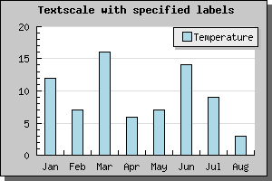
Figure 79: A simple bar plot using an automatic text scale [src]
In the following section we will work through an number of examples on how to manipulate labels on a text scale. Primarily we will investigate how to best handle the case where you have a large number of values.
As a remainder; Text scale is meant to be used on the X-axis when the X-axis doesn't have a numeric value, i.e you are only interested in linear ordering of the data. If you don't specify the labels manually they will be set automatically starting from 1 as the example below shows.
To specify the labels on the X-axis as suitable text strings you call the method Axis::SetTickLabels() with an array containing the text-labels. If there are more data points than labels the non-specified labels will be given their ordinal number. If we augment the previous example with the name of the month we get the following new example
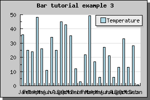
What happen now if we have a larger number of bars? Let's try with 25 bars and see what result we get.
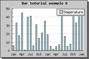
Not all to impressive. The labels are to close and they overlap. Hence it is not a good idea to display every label. To adjust what labels are to be displayed you use the SetTextLabelInterval() method. The argument to this method is the interval between text labels. So to display only every 3 month you would add the line
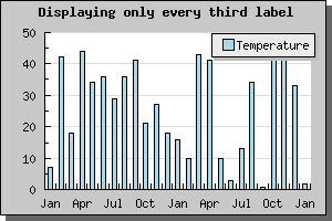
 $graph->xaxis->SetTextLabelIntervall(3
)
Which would give the result shown below
Much better, quite readable.
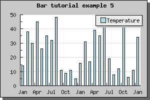
If we have an even larger data set it might not longer be meaningful to display all the tick marks since they would simple become to close. In JpGraph there is a possibility to specify that you only would like every n:th tick mark to be visible ( SetTextTickIntervall() ). For bar graphs using text scale however, that might not be such a good idea since the tick marks are between the bars and the labels centered under the bars. If we only were to display, say, every 3 tick mark it wouldn't look to good. Not that we can't do it, as the example below shows, but it just doesn't look very good.
A better way to handle large data set is simply to hide the tick marks all together. Tick marks may be hidden by calling the method Axis::HideTicks(); If we hide all the ticks on the X-axis we will get the result shown below